ATTICA
CASE STUDY
WHAT WAS THE BRIEF?
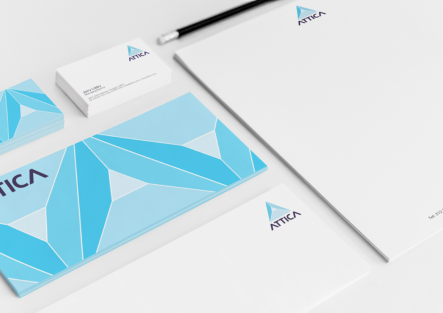
A Chicago based loft conversion company approached me (via a friend, I wasn’t international then!) to create a brand suite for their new startup. A logo, brand colours, stationary and a website holding page were required. They wanted it took be modern. professional but accessible to all age demographics.
HOW DID YOU APPROACH THE INITIAL RESEARCH & EXPLORATIVE STAGES?
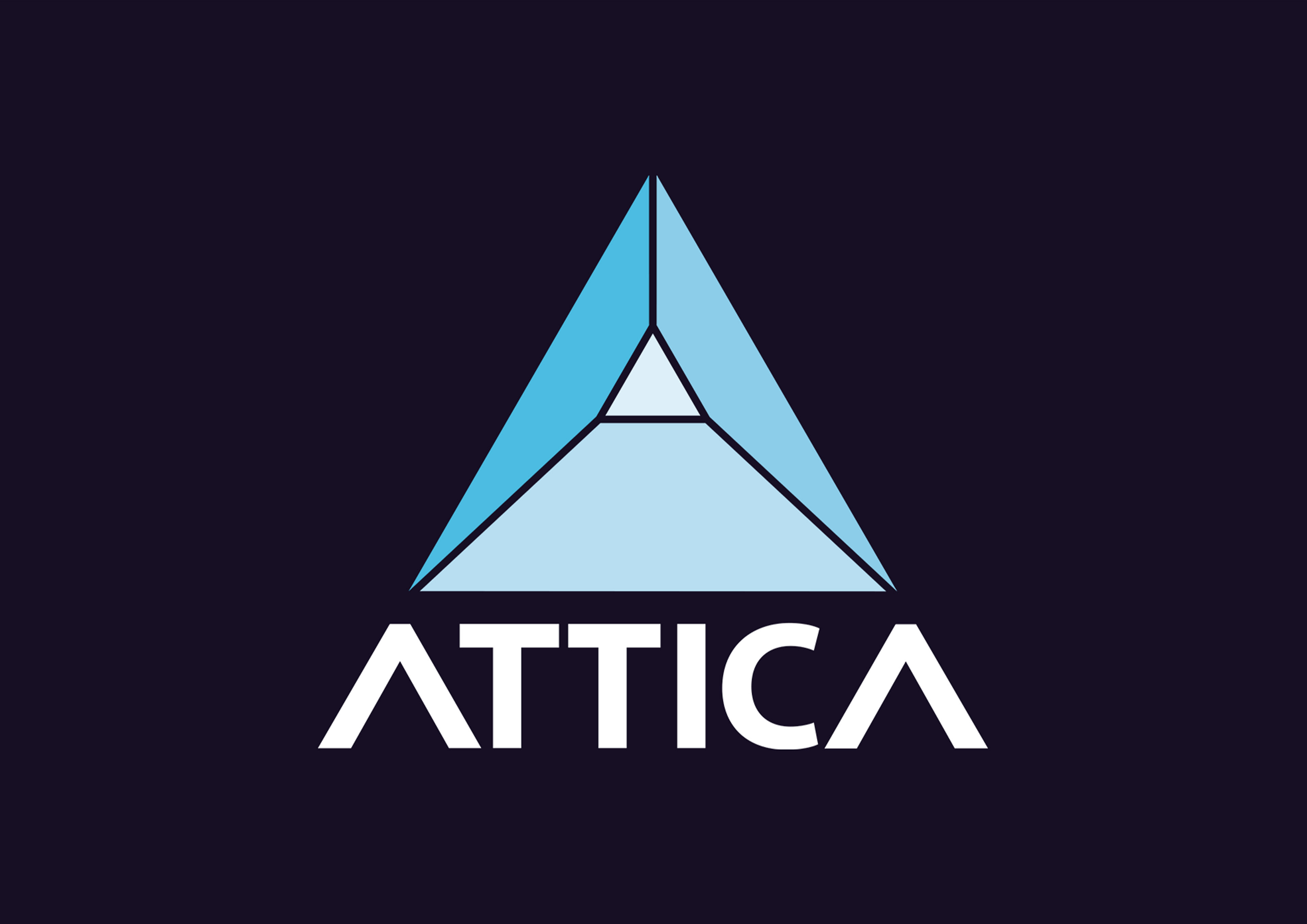
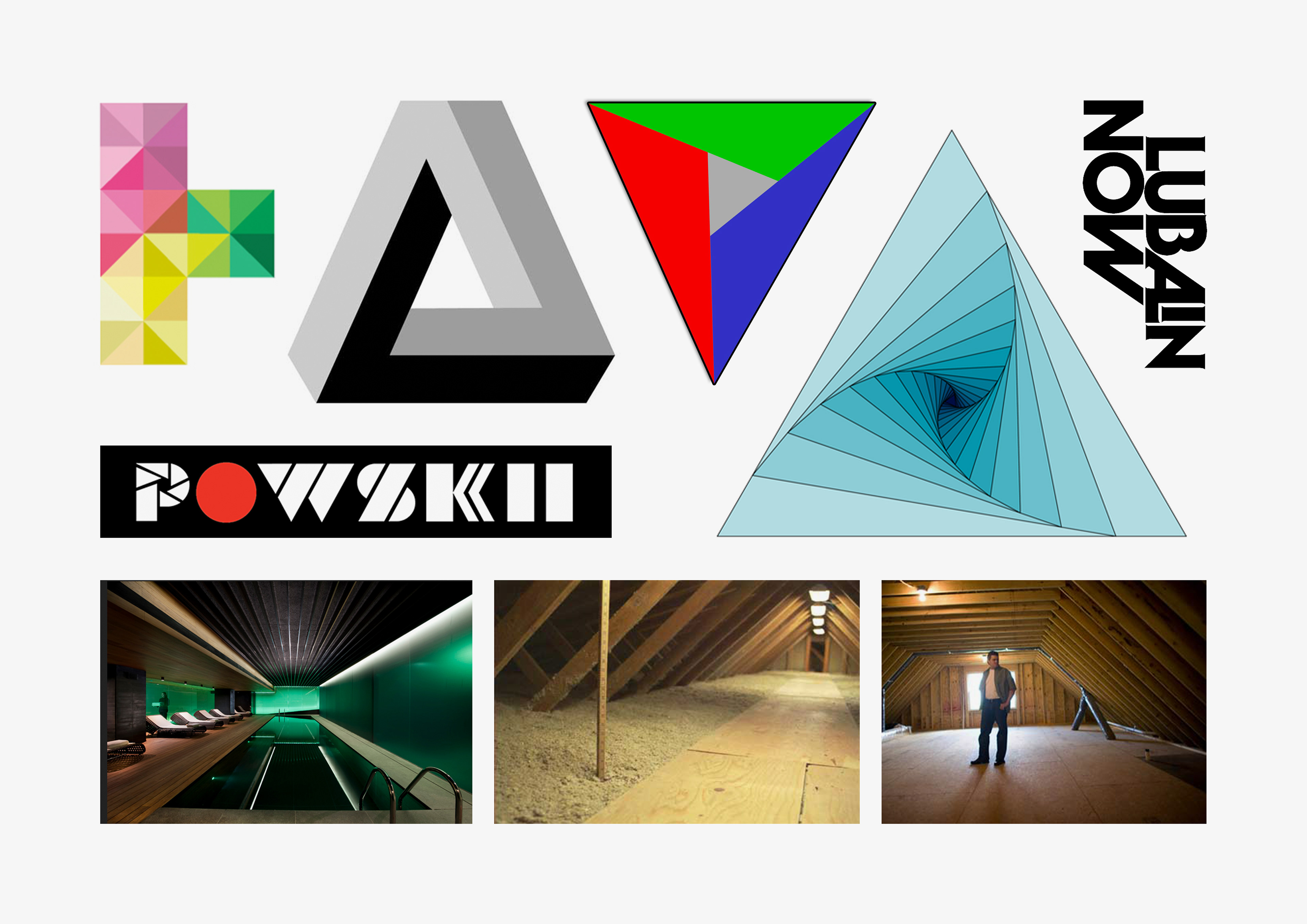
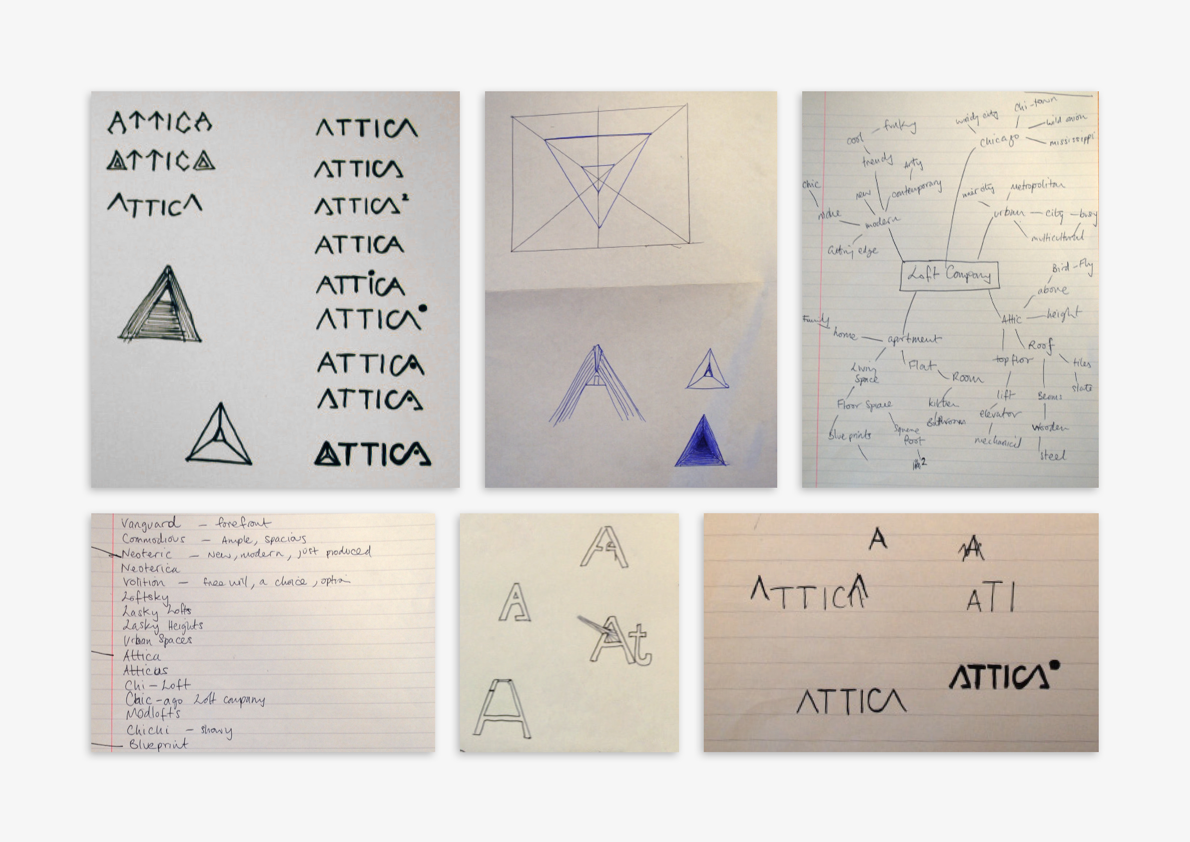
My initial idea was to use the shape of the majority of loft conversions, and see how this shape could create an engaging logo. The triangular shape of the roofs is where my inspiration came from so I looked at developing this idea further.
WHAT SOLUTIONS WERE PRESENTED?
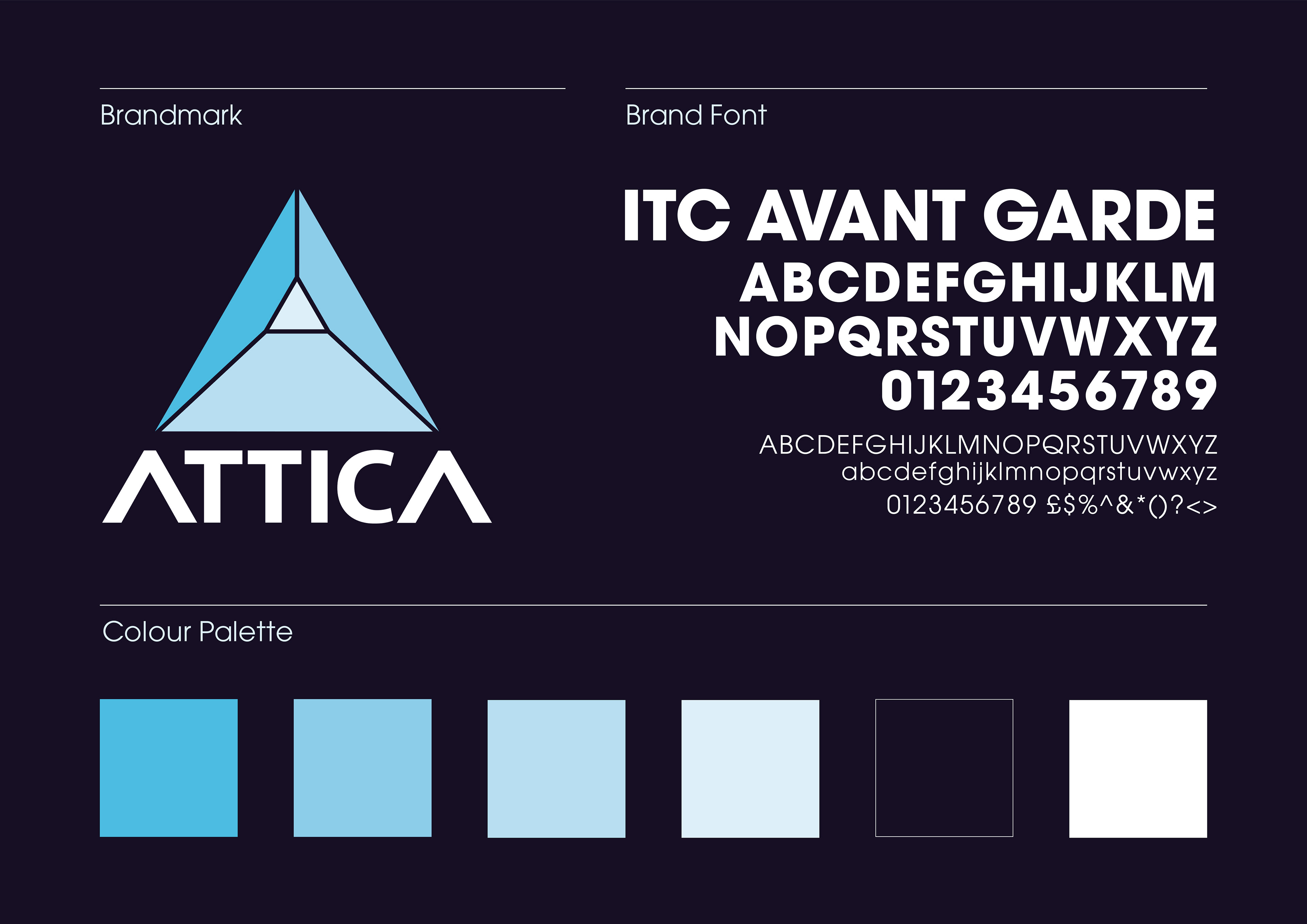
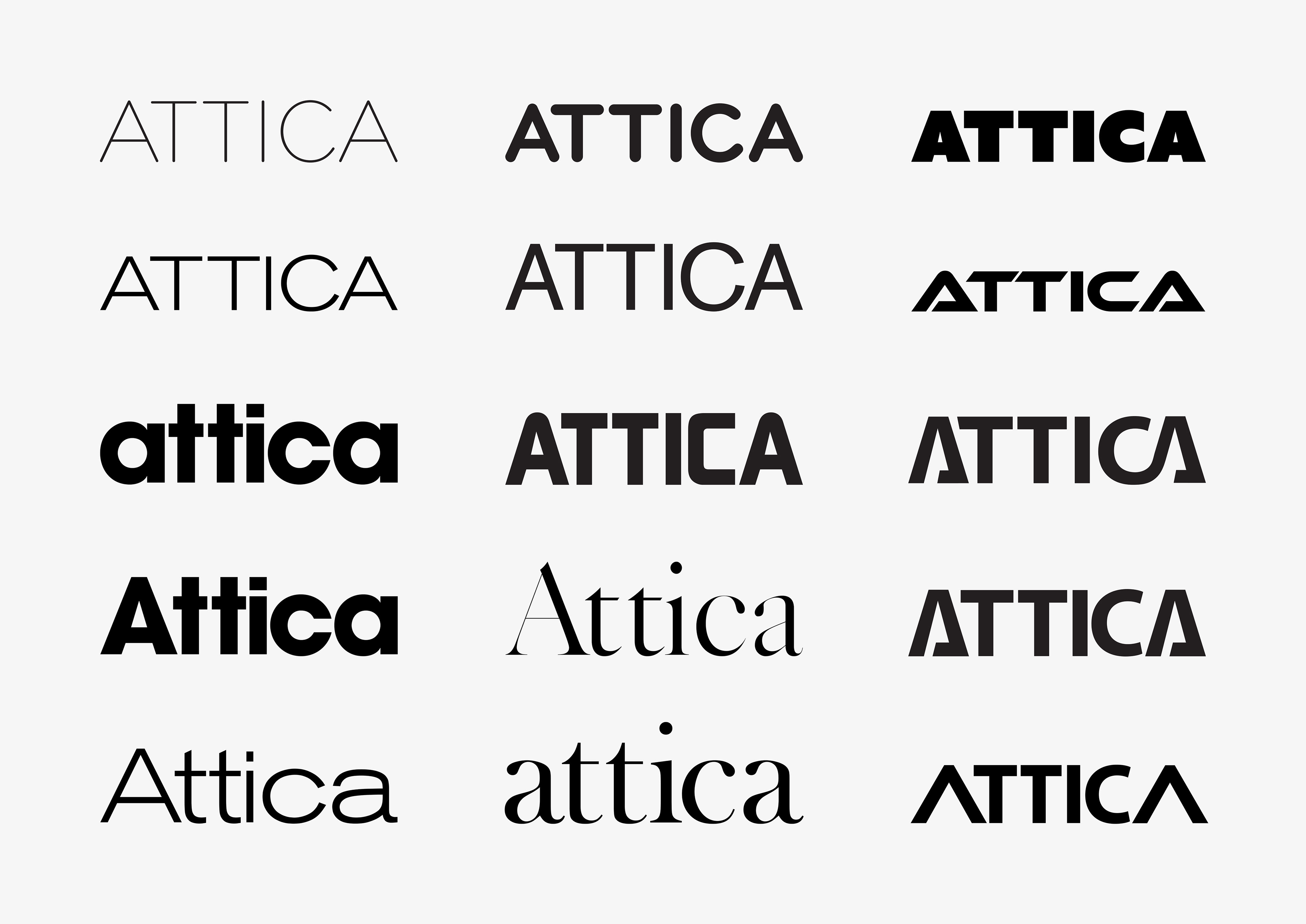
After looking at upper and lowercase versions of the word Attica, I felt for it to be most aesthetically pleasing that a capitalised version should be used. This meant I could modify the stems of both A's to mimic the angle of the logo mark above. I also removed the bars from the A's as another nod to the triangular shape of lofts.
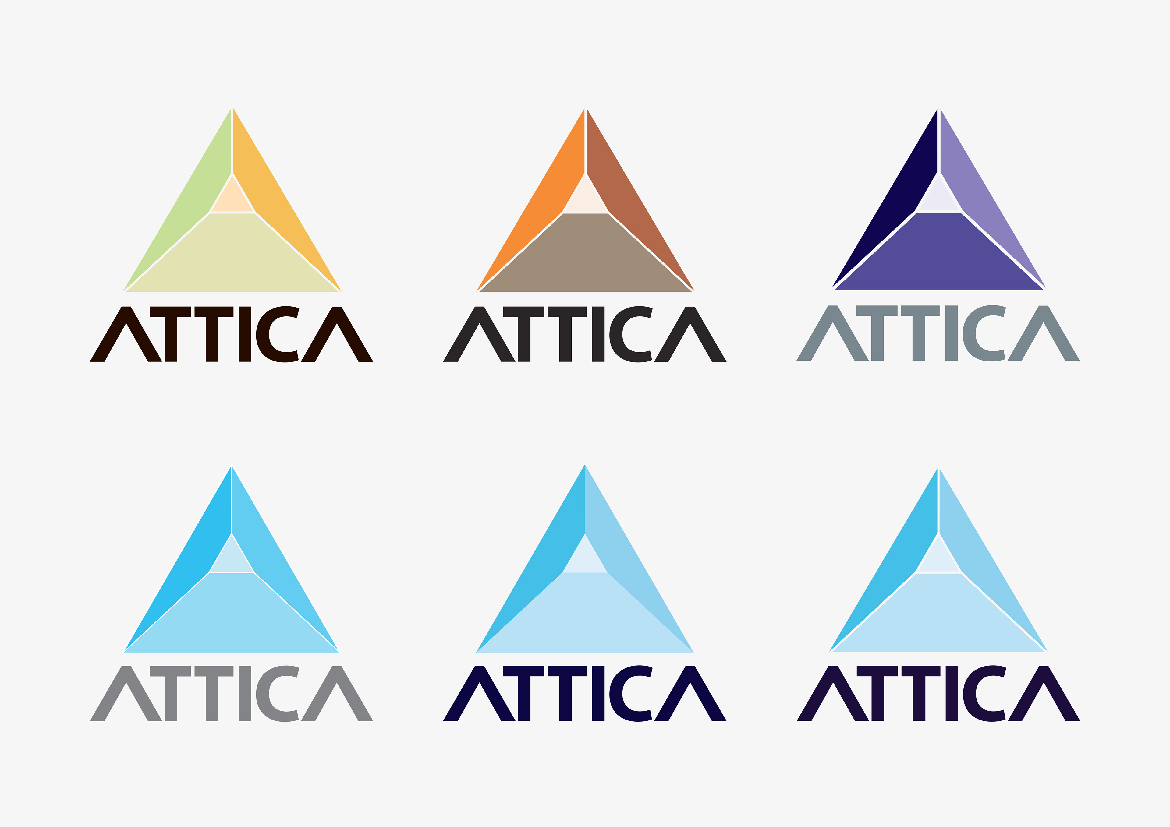
Colour-wise I wanted the palette to be professional but not too corporate, so I used a combination of lighter blues to stay in the corporate realm. I also looks at browns and oranges to mimic wood which the lofts are made from and also purples which would signify luxury and wealth but in the end I felt the combination of blues worked best for the brand.
WHAT WAS THE OUTCOME?
A professional and modern looking brand, where the logo could be used as a pattern for the stationary set and where the wordmark could be used on it's own due to it's distinctive A's.
Just as importantly the client was happy as the brief was followed and finished within budget.
Follow this link to see the project in full.